Friday, January 29, 2010
Banksy “Exit Through the Gift Shop” Film Trailer
Jet-Set Graffiti gives us a peek into Banksy’s upcoming film, “Exit Through the Gift Shop”, which will make its official debut at Sundance. The film is definitely something to look forward to and may change the perception of street art as we know it. Stay tuned.
The Space Bar


The number of cables and clutter on my desk only seems to increase. The Space Bar addresses this problem by offering an invaluable shelf space that houses six USB ports and a convenient slot to house a keyboard.

The minimalist design maximizes desk space, and while I haven't tested one out yet, the shelf seems like it would entice me to organize my gadgets.
The Space Bar is available from Quirky, a participatory product design outlet, for $42.
Thursday, January 28, 2010
OriginalFake 2010 Spring/Summer Collection Sticker Set

Few will ever have the art of KAWS adorning their homes, making various OriginalFake graphic tees a more likely choice for many fans of the artist’s art. Another option that presents itself includes various little accessories including stickers. This season’s OF sticker pack is based on a handful of Companion designs as well as a Companion-head Chum. Available at various OriginalFake retailers and Taiwan’s Invincible.
via: hypebeast.
Cargo Collective: Interview with Co-Founder Folkert Gorter

Cargo, a web publishing platform designed specifically for the creative fields, appeals to art directors, photographers, graphic designers, visual artists and more. Created by Folkert Gorter, Josh Pangell and Rene Daalder, the service enables users to publish a wide variety of visual content with ease, effectively dispensing with the need to build costly custom portfolio sites. Not only does Cargo make putting your work out there painless, it also introduces artists and designers to one another with its community-building functionality (hence, the collective part of the name). Much like an RSS feed, members can choose to follow others and get regular updates on when they add new work.

Having evolved from the system that powers the SpaceCollective community, Cargo combines the elegance of a simple, fluid architecture with the tools that provide for enough customization to satisfy the most advanced user. Anyone familiar with blogging platforms will be able to dive right in and create a simple record of his or her work. Similar to blog "entries," Cargo uses "projects," which contain entry fields for images, text, and more. These projects then populate the user's main page in the form of expandable thumbnails (whether this is the actual homepage or a secondary page is entirely up to the user). Though Cargo provides an existing set of templates for users, the real beauty of the platform is being able to get under the hood and tweak colors, fonts, borders, margins and layout without too much difficulty. (Page view of Matthew Curry's profile pictured above.)
We took an opportunity to ask Gorter some questions about how Cargo started and where it's headed. Below are his replies, mixed with a few examples of websites running on the Cargo platform.

Who are the minds behind Cargo and how did it start?
I started collaborating with Rene Daalder on SpaceCollective in 2005. Shortly after, Josh Pangell, who is responsible for all technology and development, joined us. We couldn't find anything suitable for developing the SpaceCollective community so we decided to build everything from scratch; a platform that would allow users to easily share and manage ideas and media.
SpaceCollective started collaborating a lot with universities and students, and from there we saw a need for members to publish their work as a personal, ongoing archive; this we further developed in a tool that is now called Cargo. We wanted to create a way for them to publish their work online and at the same time try to blur the boundaries between what is considered a portfolio and what is considered a blog, and instead encourage people to see their websites as an ongoing feed of creative output. (The Office of Feltron pictured above.)

What sets Cargo apart from other content management platforms?
Our interface design philosophy in relation to Cargo can be summed up as "the content is the Cargo." In other words, "the work is the interface is the product is the brand is the network is the Cargo," and so on. For example, inside the various Cargo networks you are not represented by an avatar of your choosing but by the visual representation of your most recently shared work. We approach every interface challenge in this way. Another aspect is the networked nature of the system. It is set up in a way that it is almost impossible not to learn from or be inspired by other users. (DJ Raeo pictured above.)

How would you describe the user base? Are most people familiar web publishing and architecture?
Our members seem to be situated somewhere between savvy and not so savvy when it comes to HTML and CSS. We're not really engineers either, and in a way we're designing this for ourselves. At the same time, we're intimately involved with how content is displayed on the web.
We tried to set up the interface in a way that accommodates this variety of skill sets, and puts a lot of emphasis on members learning more about basic web techniques in a playful way. One user said he loves working with Cargo because he gets to touch the important stuff, he can break things. In our forums members tell us they enjoy customizing their Cargo websites because they learn a lot about how the web works. ( Bruce Mau Design pictured above.)

To what extent is it customizable?
You can do practically anything. In the CMS, each project contains an input area where you can enter things like text, images, embedded media, javascript, etc. And things like widths and margins are controlled by the CSS. One of the next steps is to allow members to share their customizations, as well as rolling out new design templates on a continuous basis.
How do you plan to grow the community?
In order to maintain a high level of creative content, we're currently keeping the platform by invite only. We're also enabling current members to invite others soon.
(Always With Honor pictured above.)
via: coolhunting.
Wednesday, January 27, 2010
Alien Workshop x Andy Warhol


Alien Workshop introduces their initial collaboration offering with The Andy Warhol Foundation for the Visual Arts, Inc.
As the preeminent American artist of the 20th Century, Andy Warhol challenged the world to see art differently. This distinctive project presents a new approach to skateboard/artist collaborations by pairing unique examples of Warhol’s groundbreaking artwork with each of the ten iconoclast pro riders sponsored by Alien Workshop.
Featuring five pro decks with works from Warhol’s Death & Disaster Series and five pro decks showcasing his iconic Pop works, the complete set is shipped in custom printed board box packaging inspired by Warhol’s box sculptures from the 1960’s.
Augmented Reality: Rochambeau T-shirt

In this month's issue of tee-magazine's T-post, is this "Paper, Rock, Scissors" T-shirt. It looks normal in real life, but when worn in front of a webcam hooked up to T-post's special web app, a ghostly, green hand emerges from it and challenges you to a game of Rochambeau.
The Selby: Tatsuhiko “Ryu” Akashi of MEDICOM TOY


The Selby’s latest features takes him to the workspace of MEDICOM TOY’s Tatsuhiko “Ryu” Akashi. As you’d imagine the space is littered with toys from the iconic BEARBRICK to OriginalFake Companions and various other toys and figures that fall under MEDICOM TOY’s expansive line of toys. For a further look, head over to TheSelby.com.


via: hypebeast.
The 2009 Feltron Annual Report

Infographic designer Nicholas Felton has released his fifth annual report, the culmination of yet another year's worth of data accretion and (according to his Facebook status) well over 200 hours of labor. With The 2009 Feltron Annual Report, Felton stepped up his game a sizable notch by creating his first ever crowd-sourced report, enlisting the help of relatives, friends, colleagues and even his dentist.
Calling daily on the people he met who he felt "had discerned enough of my personality and activities" to submit a record of the encounter through an online survey, the designer tracked responses and used his own subjective analysis to come up with the data set. While Felton acknowledges the variations in accuracy his methods produce, he exlpains that he "strived to sort and collate the data in a clinical and repeatable manner that could be reproduced by someone looking for the same stories I have selected. "
Felton also notes that the volume of data was so unwieldy it could have easily spiraled into several more reports. To manage all of the information (and keep his sanity), he enlisted the help of such tools as Processing and Amazon's Mechanical Turk. The final product once again makes an intriguingly elegant representation of an individual's activities over the course of a year —this time recorded under the surveillance of his peers.

Swayspace in Brooklyn, NY is making a letterpresss edition of 16-page the report. using four colors on 80-pound French Durotone cover stock. Individually numbered, signed and mailed in March, you can pre-order the printed report for $20 from the Feltron shop.

If you've never seen his work before, we encourage you to visit his site now.
via: coolhunting.
Tuesday, January 26, 2010
Midem: Pharrell Williams Interview
Pharrell Keynote at MIDEM 2010 from thecashmerethinker on Vimeo.
Fashion and music icon Pharrell Williams recently took part in an on-stage interview at the Midem conference which focused on the world of music business. The 40 minute talk focused on various aspects of Pharrell Williams’ approach to work and some key things including his favorite producer and upcoming projects involving Jay-Z and Hans Zimmer on a 3-D CGI film, Despicable Me.
LEGO Collection

It’s sort of amazing to think it has taken LEGO this long before the release of their own series of individual collectible mini-figures. Following a release scheme seen from other toy-companies, word on the street is that Series 1will debut in a blind box style release. 16 different figures seen here will release with accompanying accessories and carry a suggested retail price of $2 USD per figure. No word yet on availability.
Source: VINYL PULSE
Interview with Linchpin Author Seth Godin

In his latest book, "Linchpin," Internet maverick Seth Godin tackles the modern workingman's plight to stay relevant when call centers based in India and watching blockbusters online are the norms. Arguing that the shifts in the global economy make creative thinkers increasingly indispensable, Godin makes the case for embracing your inner Michelangelo to do something radically different. If that sounds a little ambitious, read on to learn why he insists on the word "art," as well as how his organized press blitz (timed coverage on hand-picked blogs, of which this interview is a part) actively experiments with his theory.
To get your own copy of Linchpin head to Amazon or Barnes & Noble.
Cool Hunting: How does this unconventional approach to PR illustrate what you're talking about in Linchpin?
Seth Godin: My thesis—just to start from the beginning—is that we got tricked for 50 or 100 years into believing that the way to succeed was to keep calm and carry on, to fit in, to do what we’re told, to be a cog in the machine. It’s what the system works best with, at least in the short run. And what has shifted is now that everything is a click away, now that anything that can be written down in a manual can be done cheaper, and now that we can outsource and diminish repetitive work quite easily, this model is showing some cracks in it.
The people who are succeeding, particularly online, are not those who fit in but those who stand out. My book is designed to sell people pretty hard on the idea that they need to overcome some understandable fears and take a leap into doing things that are worth doing and making a difference.
So what I tried to do in terms of marketing the book (and I’ve always try to take my own advice with my books) is bypass the established media, who tend to like a certain kind of book and tend to exert power in a certain sort of way. I think those people are fading away, their jobs are anyway; their power is fading.
What I said instead is, what would happen if I went directly to the people who now have power, which are the linchpins online, which are the individuals with blogs or Twitter followers or Facebook pages that other people trust. What if I asked them to be the reviewers and asked them to spread the word instead of somehow persuading someone at The New York Times to do so. So that was the plan, and so far it’s working beautifully.
We started by offering a review copy to the first three thousand people who gave a donation to the Acumen Fund, which is a charity I support. And it didn’t take very long to have more than 2,000 people do that. We raised $100,000 in about a day and a half, exceeding our goal. So those books went out yesterday. We also sent 250 people who live internationally a shorter digital version (about a fifth of the book) so that they wouldn’t have to wait for shipping. It’s already showing up on Twitter. It’s already being reviewed. Some people don’t like it, some people like it a lot. What will end up happening, my prediction is, that between 500 and 1,000 reviews of one sort or another will get posted online, which will certainly reach far more people than a review in The New York Times ever could.
My principle goal is to leverage personal interactions so that this book reaches the people it needs to reach, the people who are open to hearing what it has to say. If I wanted to reach as many people as possible I'd pay one of those talentless celebrities a thousand dollars and she could just Tweet it, but it's not gonna work.
In some ways, a linchpin sounds like Malcolm Gladwell's connector. How is it different?
Well, I’m not sure that I want to use myself as an example but what I would say is a lot of what Malcolm says about a lot of things are true, but the linchpin has little overlap at all with the connectors. A linchpin is an artist, a linchpin does work that you can’t predict. A linchpin makes a difference, changes people, does something that needed to be done that no one else knew needed to be done. So Pablo Picasso was a linchpin, Bob Dylan is a linchpin, and Jonathan Ive at Apple is a linchpin. Donna Sturgess, the woman who invented Aquafresh toothpaste, is a linchpin—they’re in most successful organizations.
If you see the pilot walk out of the cockpit on a long flight, on a JetBlue flight, walk down the aisle and comfort a four year old kid who's crying, he's a linchpin, at least in that moment. Because he's doing something that you couldn't just write down, you couldn't just systematize.
So online if you’re going to spend time reading someone’s blog, if you’re going to spend time reading someone's Tweets, if you're gonna spend time interacting with someone, it's probably not someone who's just like everyone else, because what would be the point of that?
I guess my argument then is if I looked at the pages of Cool Hunting or lots of other sites on line that highlight the remarkable and the exceptional and the things worth looking at, everything that you're talking about is the work of a linchpin. The question is, are you going to work for someone like that as a replaceable cog, or are you going to be someone like that, someone that we can’t live without, someone that we have go out of our way to please.
You encourage people to "start giving gifts that change people," which seems like a huge shift in thinking, almost bordering on spiritual.
Well, let's start by breaking this into little bits. What’s a gift? If I see a Chuck Close painting in a museum, I didn’t pay for that painting, I just get the benefit of seeing it. If I see a Karl Lagerfeld outfit walking down the street, it didn’t cost me anything to see it. If someone takes the time to use a beautiful Bodoni typeface kerned properly, it doesn’t necessarily communicate the words more clearly, but there was a gift element associated with it. We need to start with this idea that there isn’t just a transaction every time—I do something, I get money, we move on. What gifts do is they create a connection, because they’re not even. Someone gave me something, I couldn’t give them anything in return. We're not even-steven.
That connection is the first step to doing art. I'm arguing that art has nothing to do with painting. Art has to do with humanity. Poetry is clearly art, but so is product design, so is good writing, and so is giving someone a hug who needs one. So where we need to go, where I’m pushing people, is this—some people will be afraid to do this and they will persist in being low-paid cogs in the system. Others will see this as an opportunity to be artists who give gifts, gifts that change people. And once you set out to do that, what you discover is that it's easier than ever to be generous.
The way you talk about art also stands out as a new way to define it. Why not call this new approach to work something that has less baggage?
Well, you know, I grew up in a museum in Buffalo, New York—the finest contemporary art museum in America, according to Smithsonian magazine—called the Albright-Knox art gallery. You know, modern art has been in an identity crisis for fifty years. The people who like it have no clue what it is. Clearly, a long time ago, art and painting diverged.
There’s a village in China called Dafen where they paint a third of all the oil paintings in the world every day, and they’re clearly not artists, they’re doing paint-by-number in volume. So, I am taking advantage of the fact that we have an emotional connection to the word art but we have no idea what it means.
My argument is that if you go to TED, and watch Elizabeth Gilbert give a great speech, there was an art to that. I think we can all agree that in that moment she is being an artist. I don’t think art has anything to do with how much money you have. I think art has to do with whether you are operating at the highest level of what it means to be a person. The good news is that the media available to artists now is huge compared to what it used to be.
A lot of this reminds me of art critic Dave Hickey's metaphor about the '60s pulling out the tablecloth from underneath consciousness and we're trying to put it back together. What parts of the old way of thinking are valuable if any?
Well, you see, I'm getting very excited talking to you because it's opening some thinking that I hadn't had before. What did YouTube do? YouTube said that anyone who wants to be a film director can be a film director, you don’t need a permit anymore. And the internet has opened all these long tails. But what I'm saying is you don’t need to hang in the Mary Boone gallery to be an artist, and you don’t need to be approved of by ArtNews to be an artist. You just need to decide to do art. Some bad art is going to be created as a result of that democracy, but we don’t have to like that stuff, we can move on. A lot of amazing art is created because someone can look us in the eye and will to change us in a positive way, whereas at McDonald's you do that and you get fired because you’re not moving fast enough. It's hard for me to think of any job that anyone would want to have where you're not gonna be able to do art.
Those kids—the ones who are trying to sound just like Metallica or Bob Dylan, or anyone in between—they need to stop, because it's not art if it's a replica, it's not art if you’re trying to fit in. Just because you have artistic tools doesn't mean the stuff you're making is art. That's why it's so annoying to see people say "this is the way you must have a blog, this is the way you must use Twitter."
What they’re doing is creating a new status quo that ensures that most people will be mediocre and average, and that is worthless. We're gonna see lots of people create stuff, but the bar is gonna be raised as to what it takes to create something meaningful. We saw this in the painting world twenty years ago and in the fashion world in the eighties, that once someone has already gone out to the edge, going out to the same edge is worthless.
So it's getting better all the time?
I think that "better" is the really loaded term. Art makes people uncomfortable. I think that lots of things are going to get more uncomfortable faster, no question about that. Then the question is, what will we do about it and what will society reward? We're so wealthy as a culture that we've been able to spend a lot of time and money amusing ourselves. The question is, will we continue to be wealthy and, if so, then we'll be willing to amuse ourselves. Or, will we need to spend all our time and money feeding ourselves and sheltering ourselves, in which case there's gonna be a lot less room for this kind of art I'm talking about.
via: Coolhunting.
Omer Fast at Postmasters Gallery through February 13 and Whitney Museum of American Art through February 14, 2010

Omer Fast’s Nostalgia III, 2009 – production still super 16mm film transferred to HD video running time: 32:48 minutes via Whitney Museum of American Art
Now on view at Postmasters Gallery and Whitney Museum of American Art are concurrent exhibitions by the iconoclastic video artist Omer Fast, known for his non-sequential cut ups of tragedy and humanity. Splicing disjunctive narratives of traumatized subjects – actual, staged or imitated – Fast’s dystopian imaginings shun aesthetic formality and evoke what truth lies in the ambiguity of storytelling. As highly interpretive mash ups collapsing space and time, his films recall the intimacy of reality and fantasy through mingling documentary and fictional styles.
Chronicling the plight of the refugee, Omer Fast’s Nostalgia, showing at Whitney Museum of American Art, pinpoints feelings of longing and dislocation in a labyrinthian network of disparate ethnic voices. Tracing themes of displacement, war and loss through the recurrent motif of an animal trap, jumbled bits of dialogue and streams of overlaid images, Fast explores different permutations of cross-cultural encounters.
More images, text and related links after the jump…
Omer Fast’s Nostalgia III, 2009 – production still super 16mm film transferred to HD video running time: 32:48 minutes
Omer Fast’s Nostalgia I, 2009 – production still super 16mm film transferred to HD video running time: 32:48 minutes
The first of three installments, the nebulous Nostalgia I, features a British gamekeeper building an animal trap from twigs and twine according to audio instructions from a Nigerian man. As the writer, director and editor of his films, Fast employs highly technical camerawork and editing to add to the psychological tension and overall enigmatic tone of the piece.

Omer Fast’s Nostalgia II, 2009 – production still super 16mm film transferred to HD video running time: 32:48 minutes
In Nostalgia II, Fast probes the fraught encounter between strangers of different nationalities. Examining racial relations through the tense exchange between a Nigerian ex child soldier and an Englishman to whom the African entreats asylum, Fast uses special effects to produce a critique of our quite arbitrary modern interview politics, reflecting the complications inherent in broadcast journalism. Viewers are invited to watch as the Nigerian inspires horror from his interviewer, after confessing to trapping and eating monkeys, and effectively dashing any hope at asylum. Although it would seem that Fast is interested in implicating the media through this seemingly ruthless critique, as an interviewer and collaborator in the process, he is more interested in the storytelling aspect and re-framing of narratives.

Omer Fast’s Nostalgia III, 2009 – production still super 16mm film transferred to HD video running time: 32:48 minutes
Further exploiting issues race and terror, Nostalgia III completes Fast’s three part film series at Whitney Museum of American Art through a vertiginous succession of human altercations. In Nostalgia III, the artist subverts the notion of the persecuted minority, featuring three English refugees denied at the border and threatened with torture in an affluent, unnamed African democracy.
Take A Deep Breath, screening at Postmasters Gallery, takes the artist’s fascination with dread a step further, forcing the viewer to endure shocking and violent plot twists. Set at the scene of a bombing, the film first exposes the viewer to the macabre remains of the ruins’ sole survivor. But even after the victim’s identity as suicide bomber is unearthed, we are instantly projected to the scene of a degenerate soap opera, whose cast and crew immediately spiral into petty bickering. These absurd shifts from tragedy to comedy are what gives Take A Deep Breath its nightmarish tint and defines Fast’s cynical, shrewd mode of film making. When the film could gruesomely transmogrify into a moral fable, Fast resists all pathos or didactic romanticism.

Omer Fast’s Take a Deep Breath, 2008 – production still two channel HD video running time: 27:07 minutes
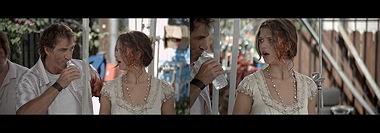
Omer Fast’s Take a Deep Breath, 2008 – production still two channel HD video running time: 27:07 minutes

Omer Fast’s Take a Deep Breath, 2008 – production still two channel HD video running time: 27:07 minutes
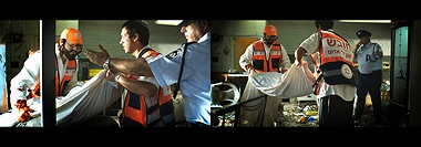
Omer Fast’s Take a Deep Breath, 2008 – production still two channel HD video running time: 27:07 minutes
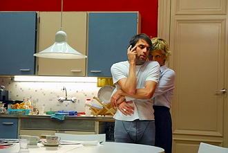
Omer Fast’s De Grote Boodschap, 2007 – production still single channel HD video running time: 27 minutes

Omer Fast’s De Grote Boodschap, 2007 – production still running time: 27 minutes
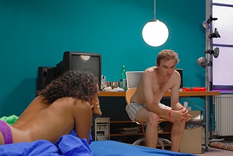
Omer Fast’s De Grote Boodschap, 2007 – production still single channel HD video running time: 27 minutes
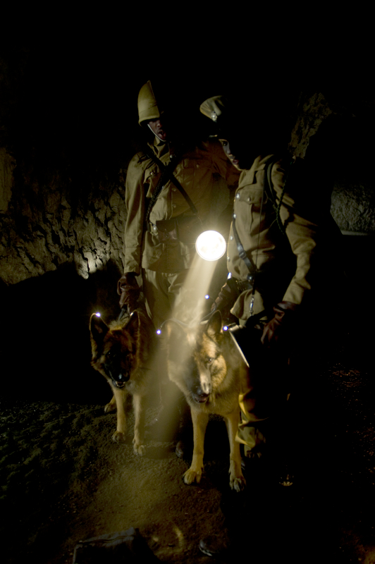
Omer Fast’s Nostalgia III, 2009 – production still super 16mm film transferred to HD video running time: 32:48 minutes
A native of Israel, Omer Fast was raised in New York but currently resides in Berlin. As the recipient of the Bucksbaum Award for his 2007 piece Casting, Fast won $100,000 and a one-man show, which he now implements in the respective Nostalgia and Postmasters exhibition. Since graduating from Hunter College with an MFA in 2000, Fast has accomplished international acclaim, showcasing his films at prestigious cultural institutions, including the Centre Pompidou in Paris and the National galerie in Berlin, which this year awarded him its Prize for Young Art.
All images via Postmasters Gallery unless otherwise noted.
via: artobserved.


